Project overview
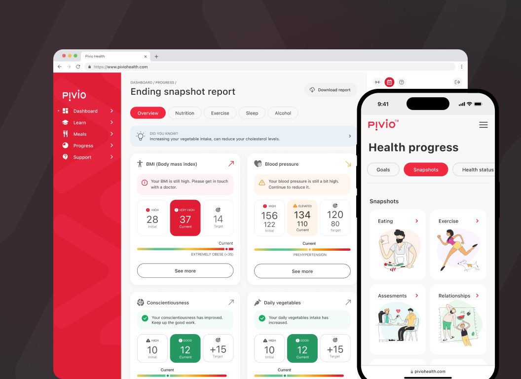
The work focused on UX & UI design for digital health applications, turning complex behavioural science and health data into a calm, supportive experience. The aim was to help users clearly understand their current state, the next best action, and how progress is measured without creating pressure or confusion.
Impact
Stronger engagement
Clear onboarding and well-defined task flows supported consistent participation in health programs.
Smoother journeys
Assessments, educational content, and coaching interactions were easier to navigate.
Lower cognitive effort
Health data and behavioural concepts were presented in digestible, actionable steps.
Increased confidence
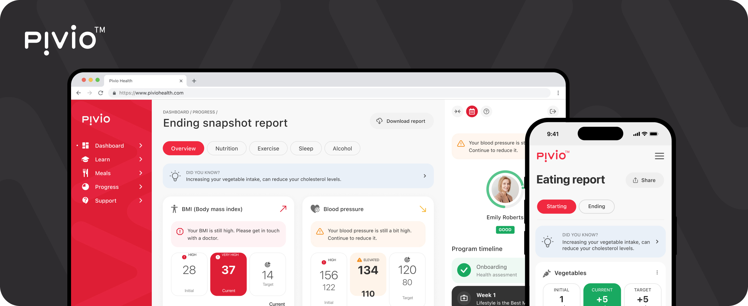
Progress indicators helped users interpret their health data with greater clarity.
Meaningful feedback
Timely feedback reinforced positive behaviour and encouraged continuation.
Flexible structure
Modular patterns supported different programs, goals, and user needs.
Clear communication
Plain language and visual hierarchy reduced hesitation and misunderstanding.
Future-ready design
The platform was built to scale across additional programs and audiences.
Mission
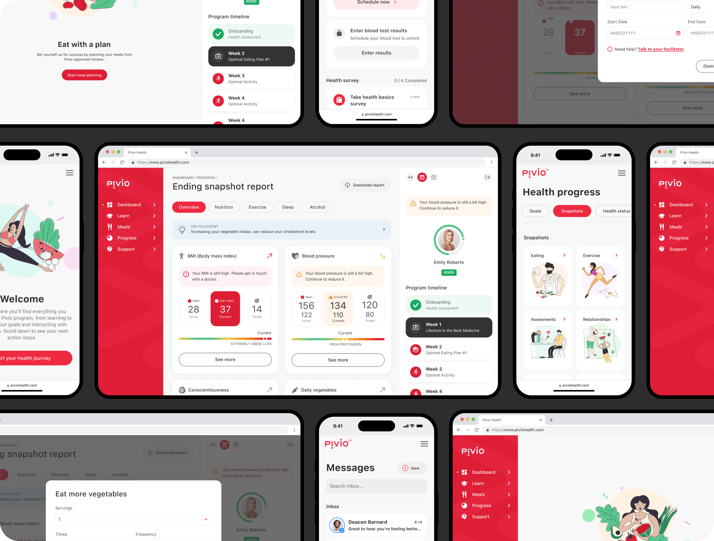
The mission was to design a digital health experience that feels reassuring, credible, and easy to follow. By reducing complexity and avoiding medical jargon, the interface helps users focus on steady progress rather than navigating systems.
Key challenges
Translating research-driven health guidance into usable digital flows.
Supporting motivation over weeks and months.
Designing for both independent users and coached journeys.
Presenting metrics without causing anxiety or overload.
Designing responsibly within personal health contexts.
Objectives
- Create a clear and welcoming onboarding experience
- Reduce friction in daily health-related tasks
- Encourage long-term participation and habit formation
- Support multiple health programs within one platform
- Improve clarity, confidence, and motivation
Design process
The team followed a research-led, iterative approach commonly used in digital health UX design. Journeys were mapped to surface friction, followed by rapid experimentation and validation before moving into detailed interface design.
Research & insights
User interviews, product workshops, and input from health specialists revealed where understanding, motivation, and confidence tended to break down.
Ideation & wireframes
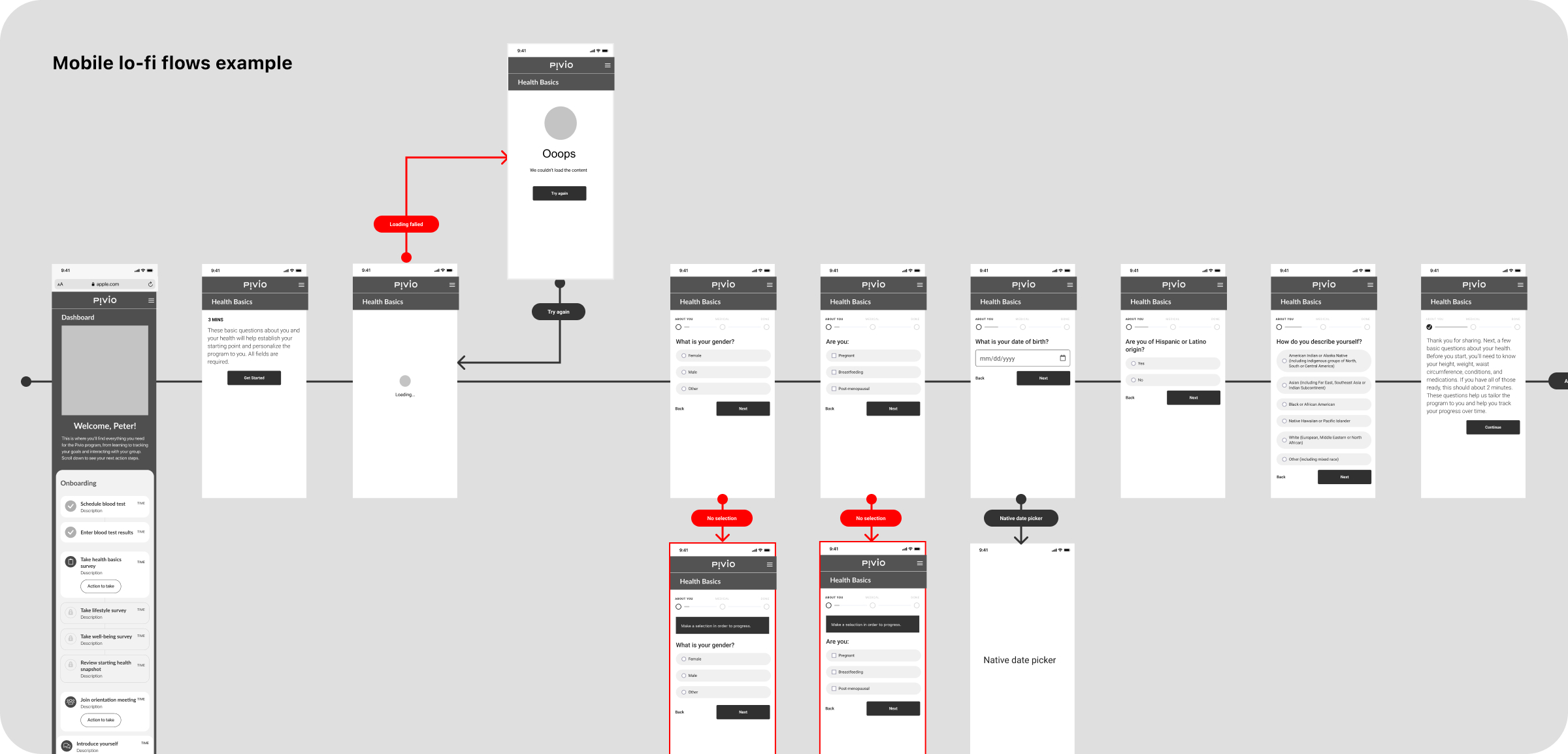
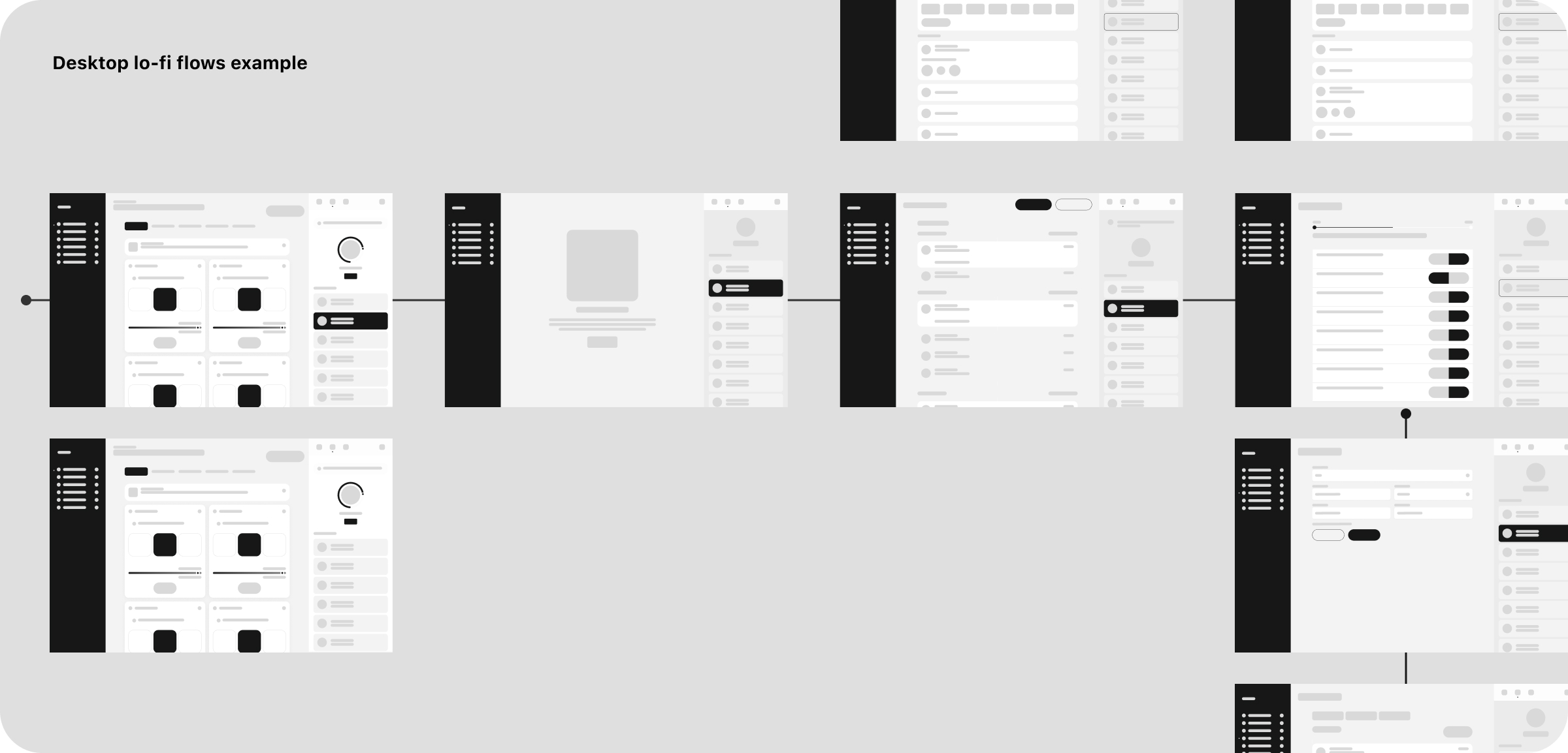
Low-fidelity flows explored structure, content sequencing, and hierarchy, enabling fast alignment with the product team.
Hi-fi designs & prototyping
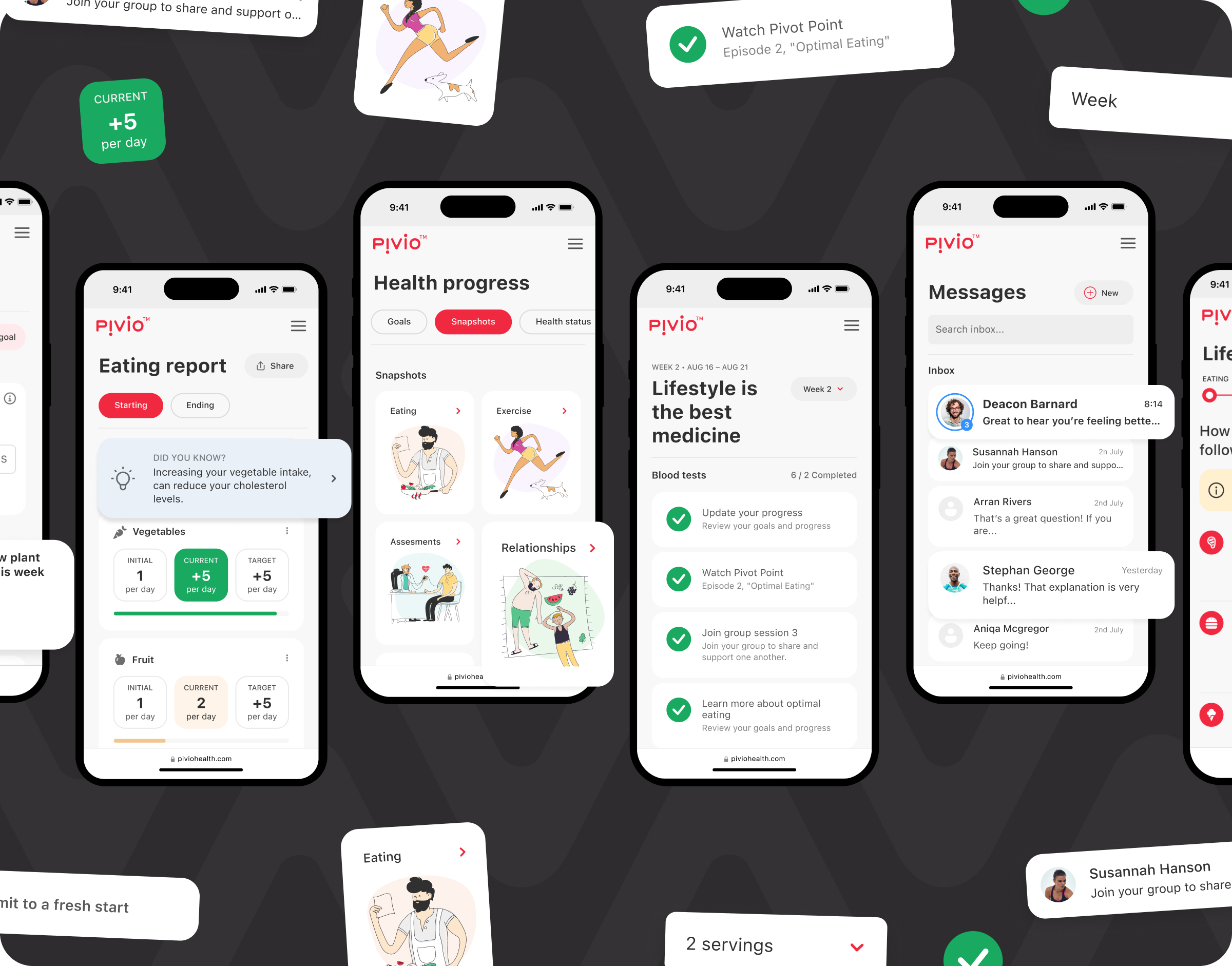
High-fidelity designs focused on tone, clarity, and accessibility, supported by interactive prototypes for validation.
Testing
Usability testing refined interactions and ensured users could easily understand next steps and progress.
Accessibility
Accessibility decisions prioritised readability, contrast, and reducing cognitive strain during key moments.
Design system
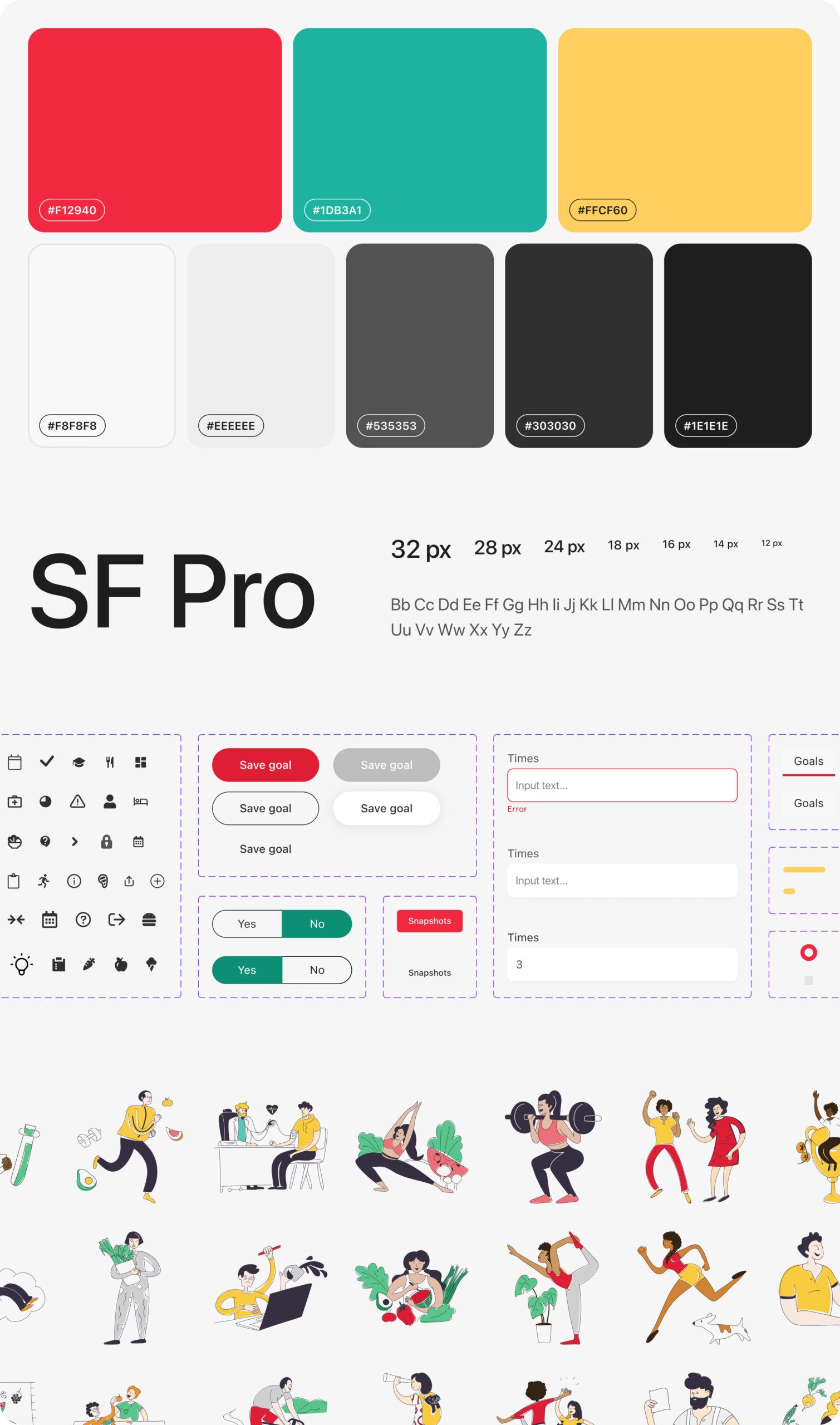
A modular design system ensured consistency across onboarding, programs, progress tracking, and coaching experiences.
Critical insights
Designing digital health products for behaviour change requires patience and restraint. Clear structure, empathetic tone, and actionable feedback help users stay engaged without feeling overwhelmed.
*This case study describes experience gained by team members across prior roles and engagements.