Archives: Projects

  • Lunation

    Lunation

    Project overview

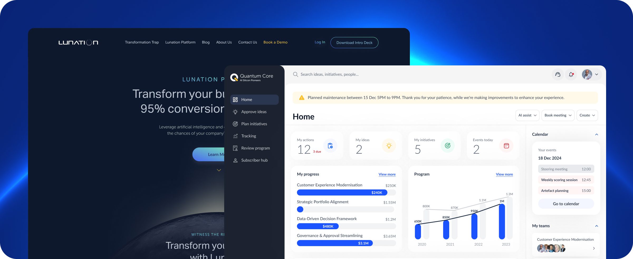
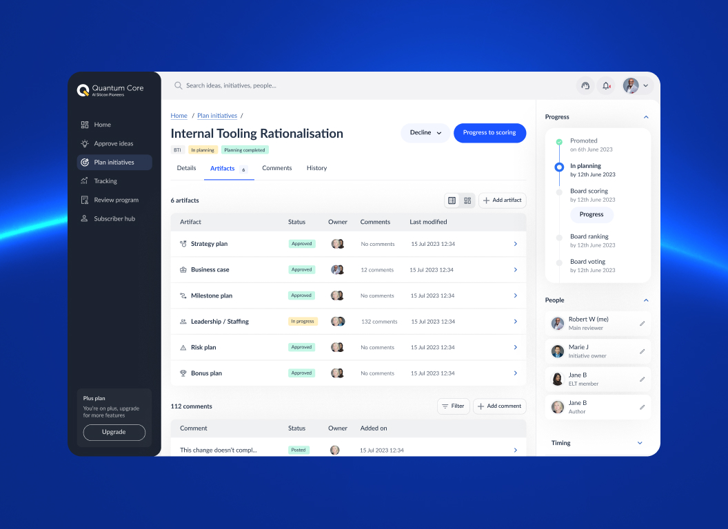
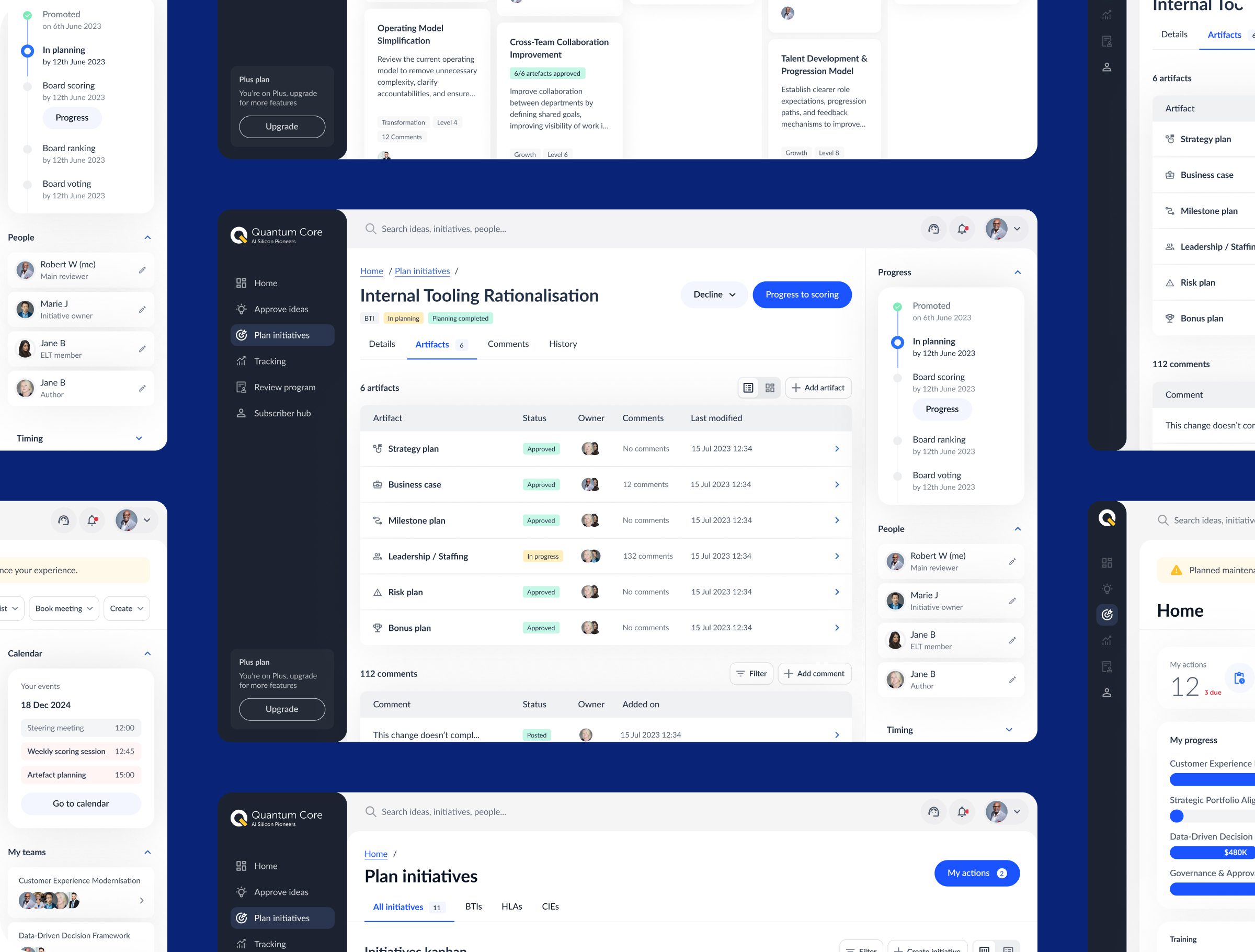
    Lunation is a web-based transformation platform designed to help organisations structure, prioritise, and execute complex change initiatives. The platform supports teams in shaping strategy, aligning stakeholders, and turning ideas into actionable programs through structured workflows and shared visibility.

    The project focused on UX & UI design for a web application MVP, translating abstract transformation concepts into practical, usable experiences. The aim was to create clarity across decision-making, collaboration, and execution while ensuring the product could scale with organisational needs.

    Role
    UX & Product Design
    Team
    Product, engineering, transformation specialists
    Responsibility
    UX strategy, discovery facilitation, research, IA, interaction design, prototyping, testing, design system foundations
    Timeline
    Discovery, MVP, iterative delivery


    Impact

    Clearer alignment

    Structured workflows helped teams align around shared goals and priorities.

    Simplified execution

    Complex transformation initiatives were broken into manageable steps.

    Reduced friction

    Clear navigation and hierarchy lowered cognitive effort for users.

    Improved confidence

    Users gained better visibility into progress and decision rationale.

    Consistent feedback

    Clear status indicators supported informed next steps.

    Flexible structure

    Modular patterns supported different transformation scenarios.

    Improved clarity

    Plain language reduced ambiguity across complex initiatives.

    Scalable foundation

    The MVP was designed to support future feature growth.

    Mission

    The mission was to design a clear, accessible web application that helps organisations navigate transformation with confidence. The experience needed to balance strategic thinking with practical execution, without overwhelming users with unnecessary complexity.

    Key challenges

    Abstract concepts
    Turning transformation strategy into actionable digital workflows.
    Multiple stakeholders
    Supporting different roles, priorities, and perspectives.
    Early-stage ambiguity
    Designing while the product direction was still forming.
    Information density
    Presenting complex data without overwhelming users.
    Adoption
    Creating an MVP that felt credible and usable from day one.

    Objectives

    • Validate the product vision through an MVP
    • Create intuitive flows for transformation planning
    • Support collaboration and shared understanding
    • Lay foundations for scalability
    • Ensure accessibility across user needs

    Design process

    The work followed a structured, research-led design process typical of web app and MVP design, combining discovery, validation, and iteration.

    Research & insights

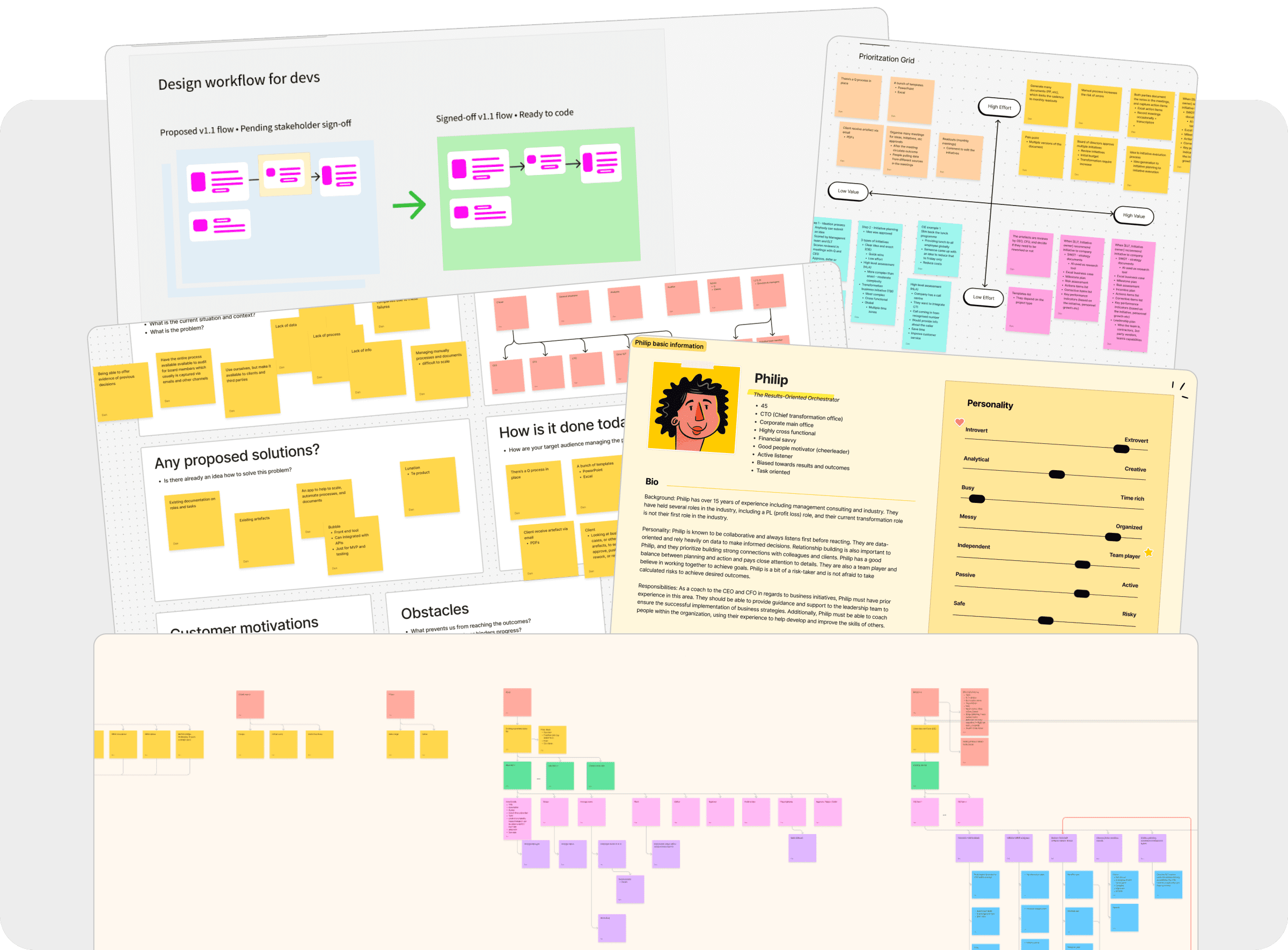
    The discovery phase included workshop facilitation, stakeholder interviews, proto-personas, Value Proposition Canvas exercises, user story mapping, user interviews, and card sorting to understand needs, mental models, and priorities.

    Ideation & wireframes

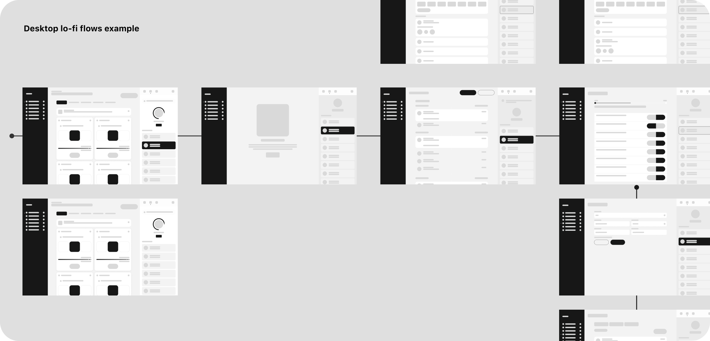
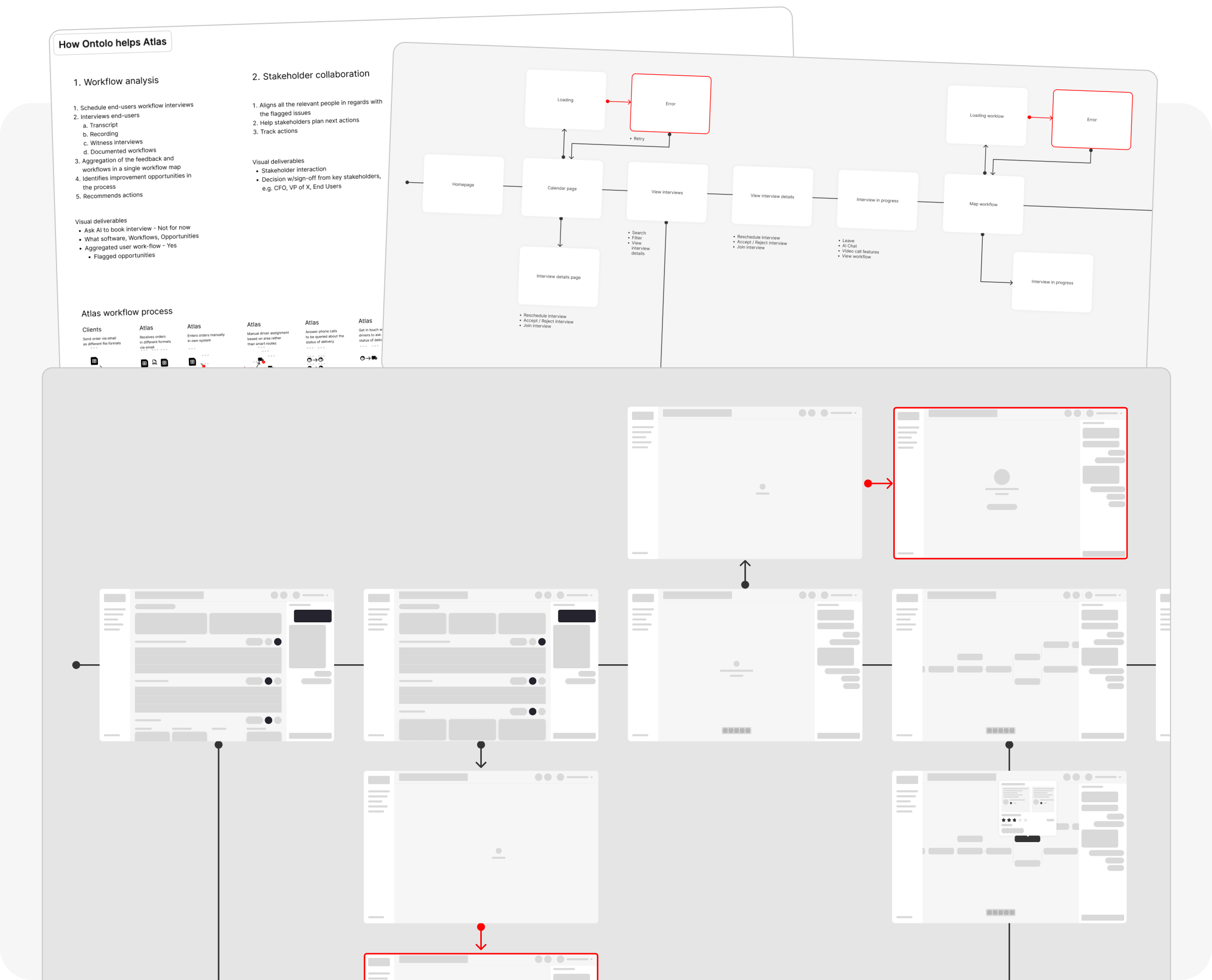
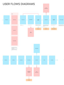
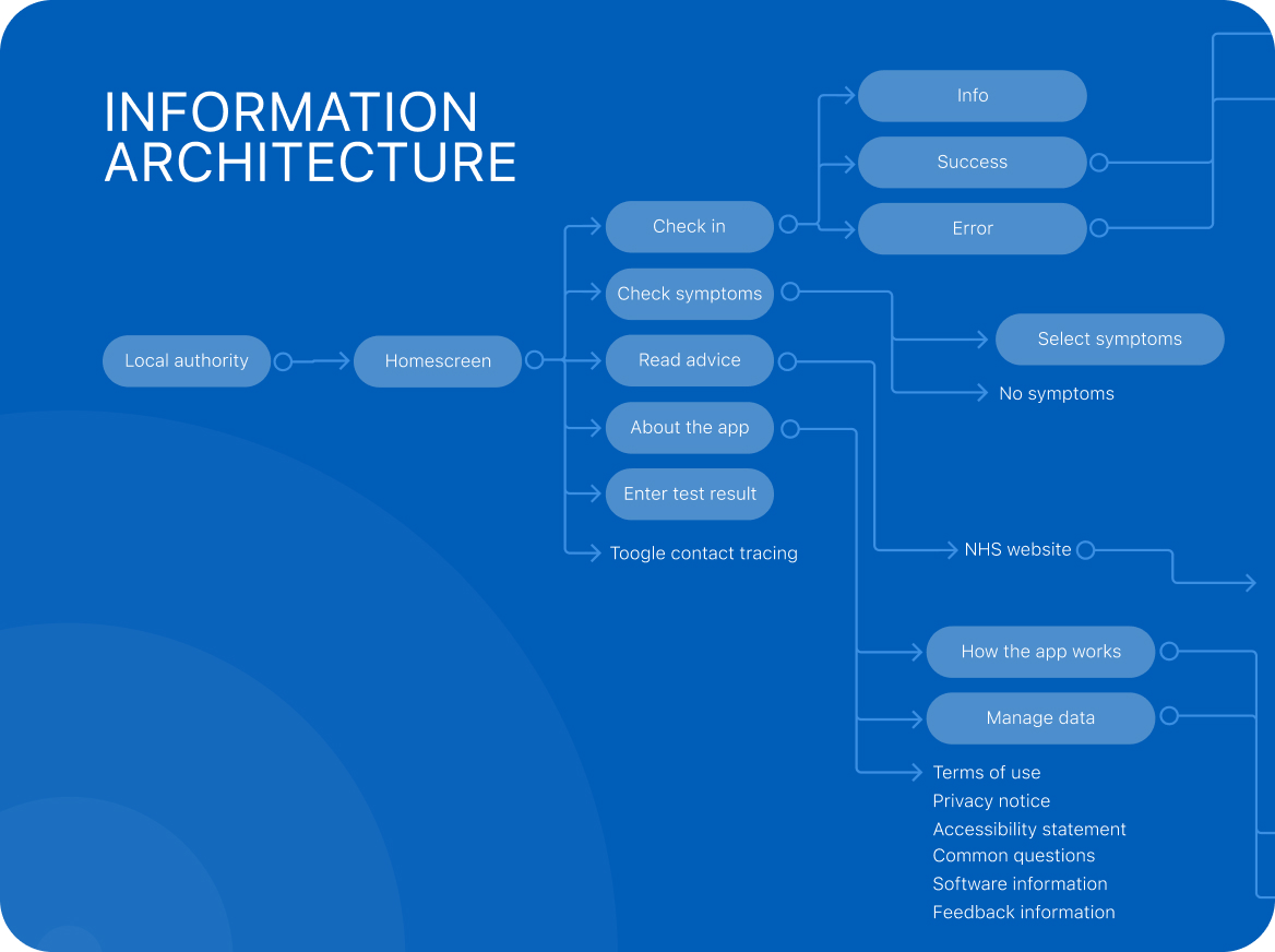
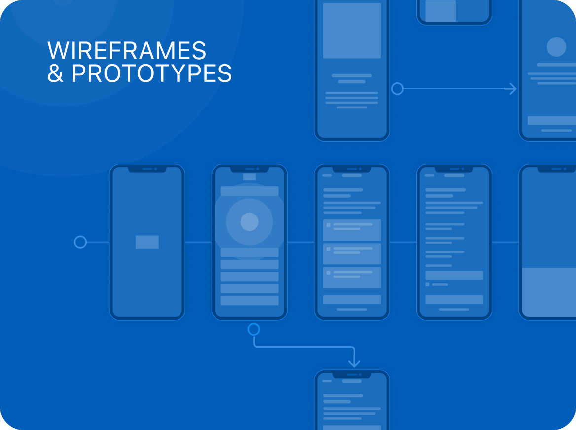
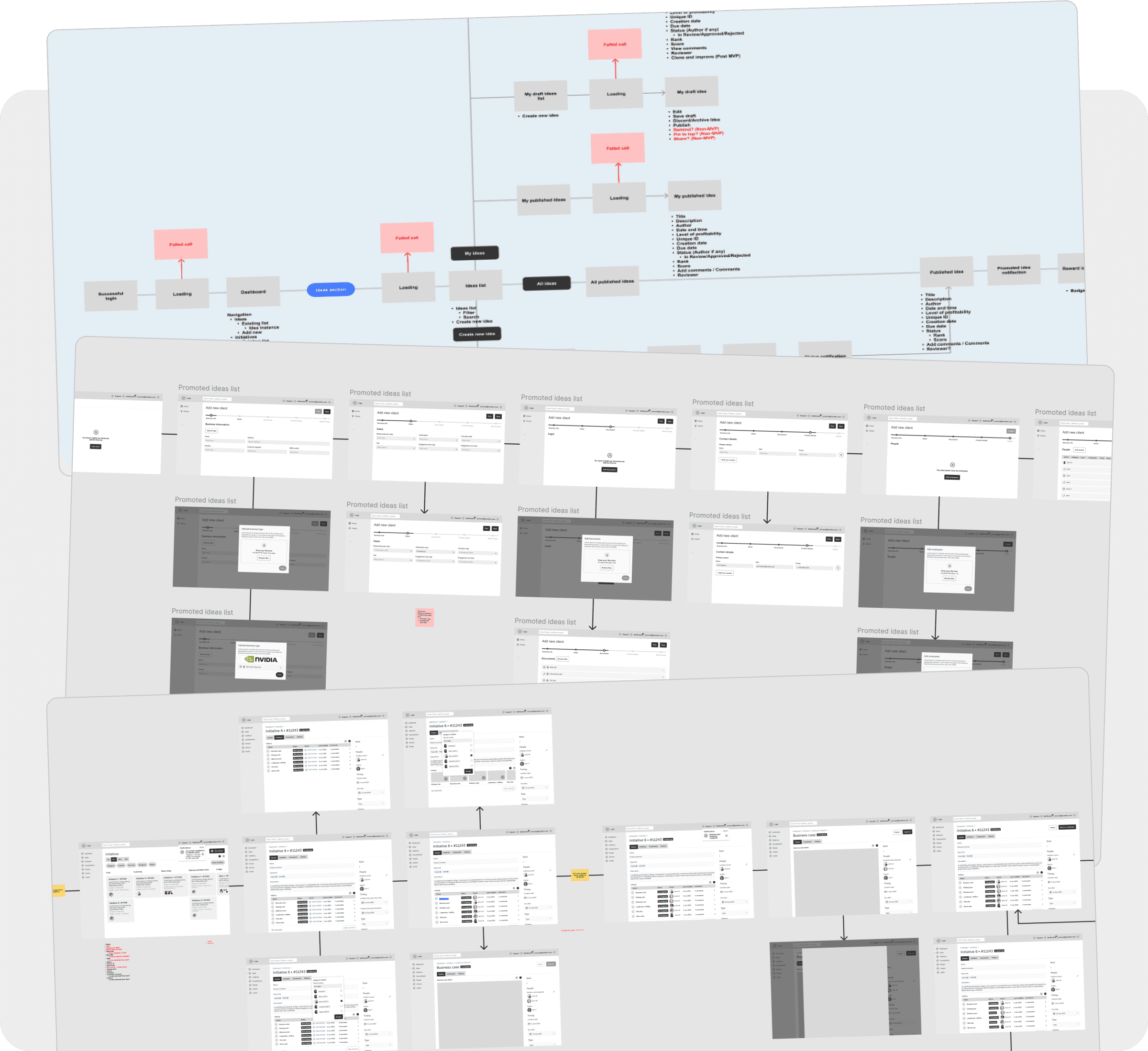
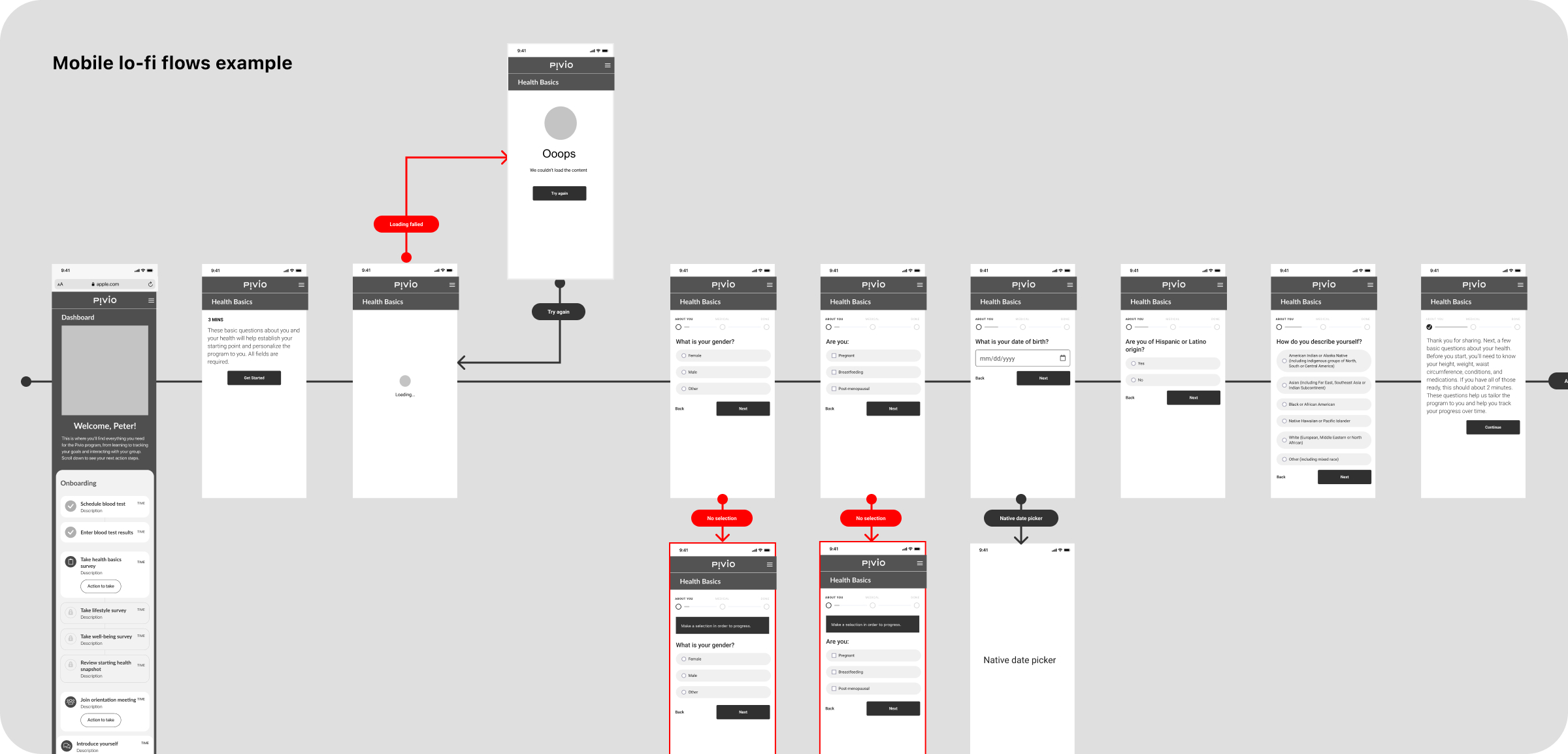
    Information architecture, user flow diagrams, and low-fidelity wireframes were used to structure the MVP before visual design.
    Hi-fi designs & prototyping

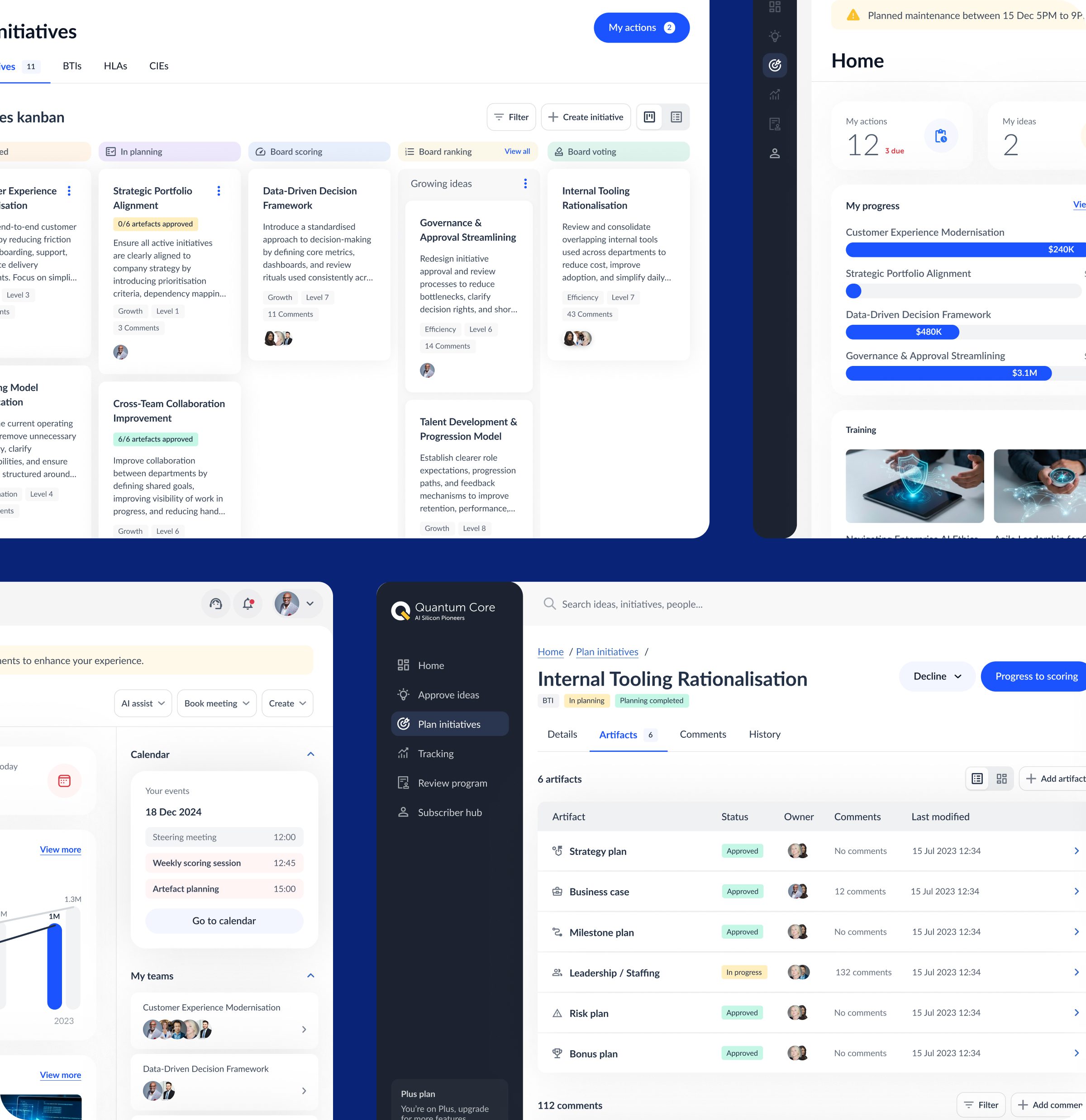
    High-fidelity designs and brand foundations were developed alongside interactive prototypes to validate usability and tone.

    Testing

    User testing sessions helped refine flows, interactions, and comprehension before further development investment.
    Accessibility

    Accessibility was considered throughout, with a focus on readability, contrast, keyboard navigation, and reducing cognitive load.

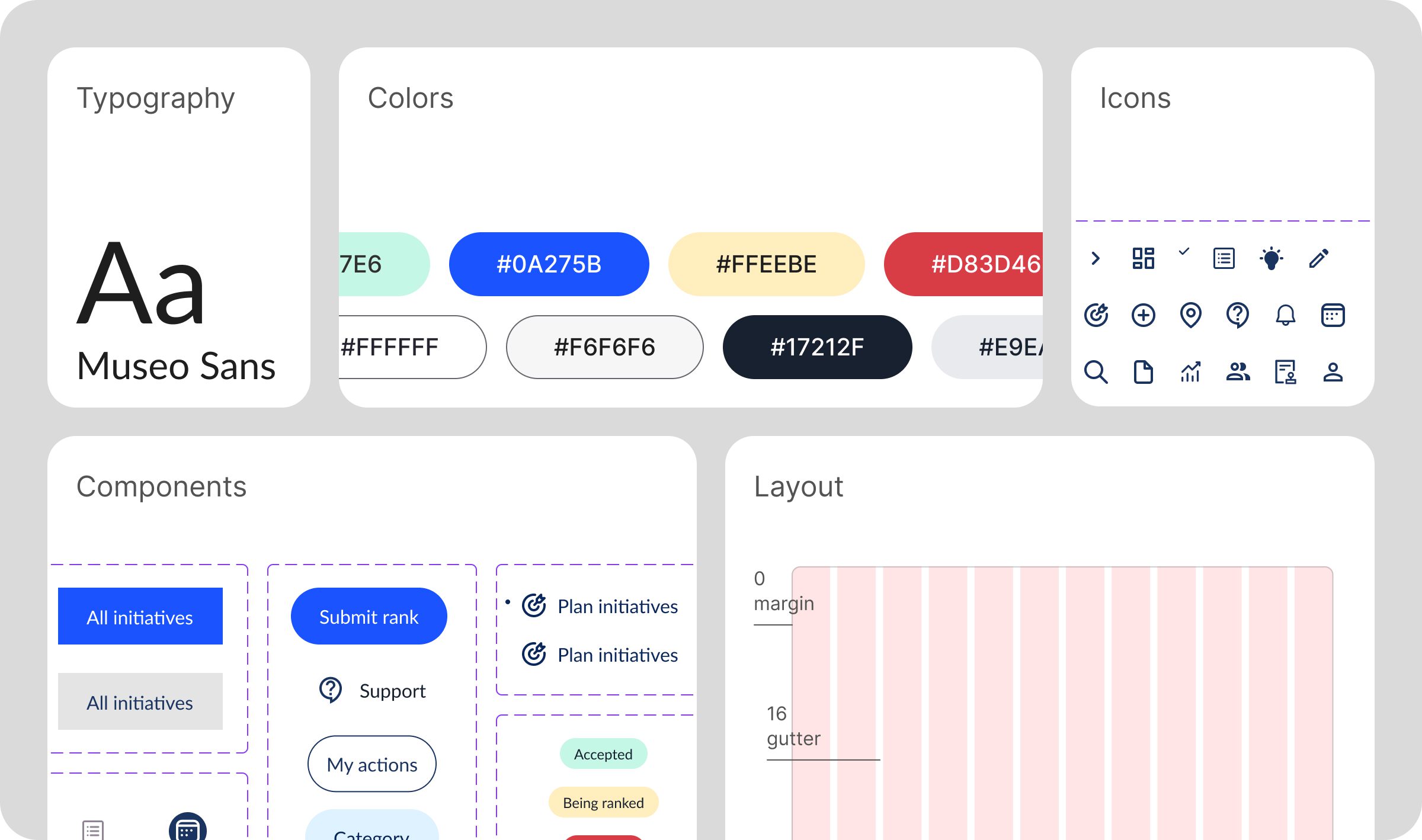
    Design system

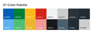
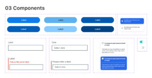
    A component library ensured consistency, scalability, and accessibility across the evolving web application.
    Critical insights

    Designing transformation software requires clarity first. Strong information architecture, accessible patterns, and early validation helped turn abstract strategy into a usable, scalable digital product.

    *This case study describes experience gained by team members across prior roles and engagements.
  • Pivio

    Pivio

    Project overview

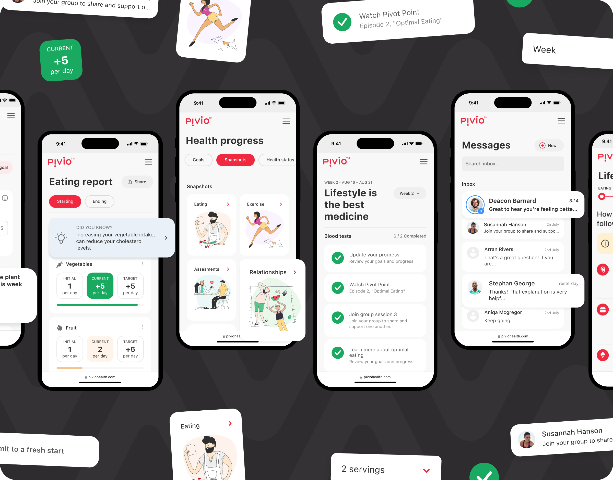
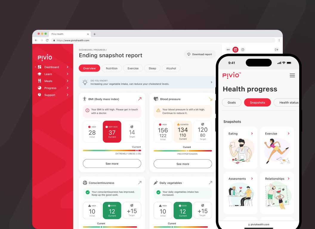
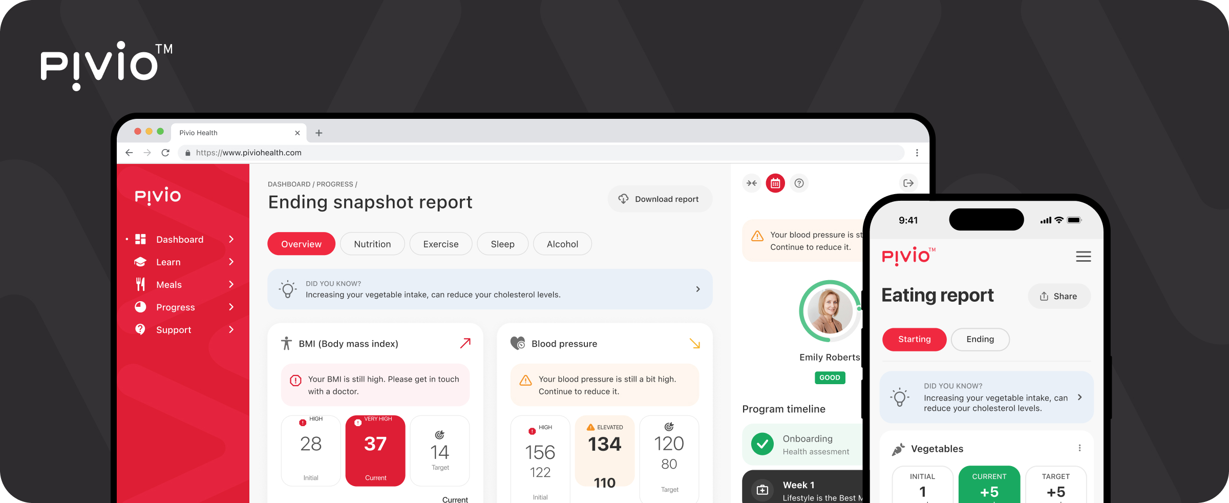
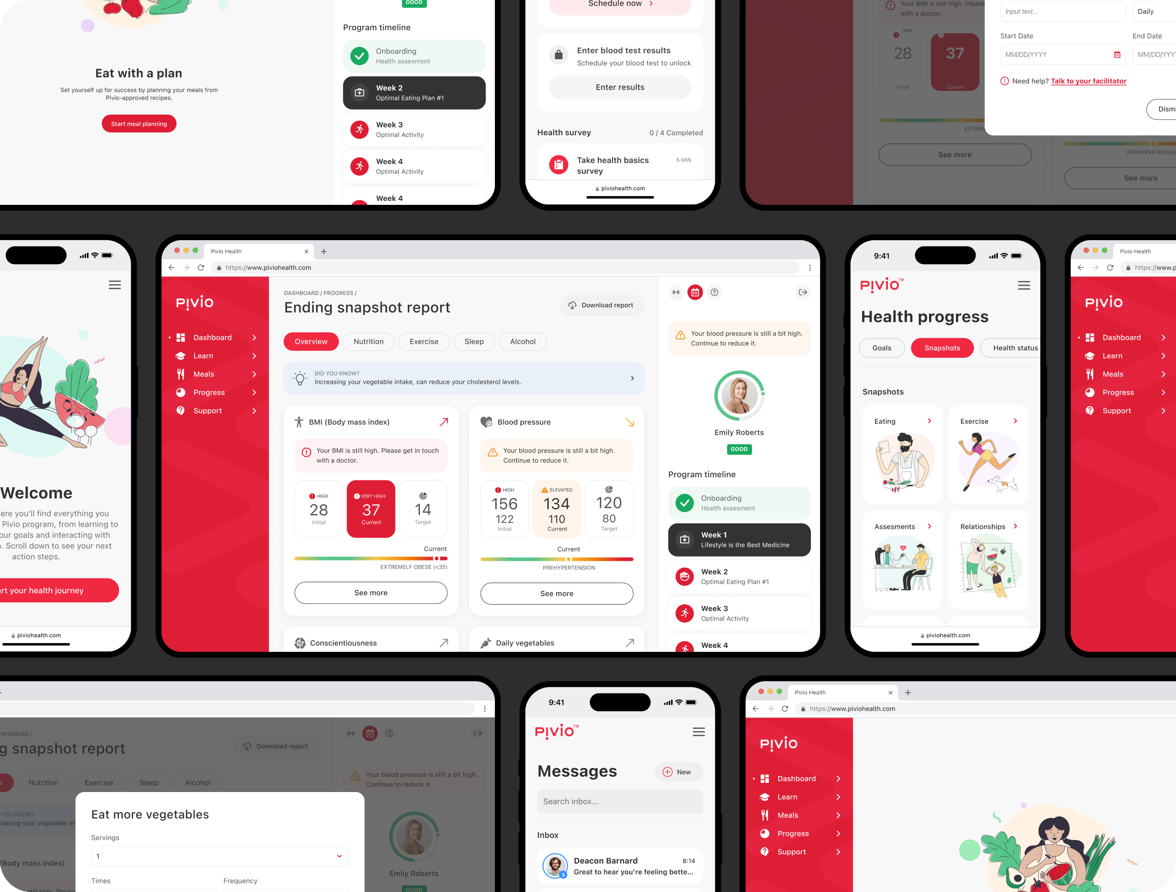
    Pivio is a digital health platform designed to support long-term lifestyle improvement through structured programs grounded in clinical research. The platform combines guided activities, coaching support, and progress tracking to help users make sustainable health changes over time.

    The work focused on UX & UI design for digital health applications, turning complex behavioural science and health data into a calm, supportive experience. The aim was to help users clearly understand their current state, the next best action, and how progress is measured without creating pressure or confusion.

    Role UX & Product Design
    Team Product, engineering, clinical & health experts
    Responsibility Digital health UX strategy, research, IA, interaction design, prototyping, testing, design system foundations
    Timeline Discovery, MVP, iterative delivery


    Impact

    Stronger engagement

    Clear onboarding and well-defined task flows supported consistent participation in health programs.

    Smoother journeys

    Assessments, educational content, and coaching interactions were easier to navigate.

    Lower cognitive effort

    Health data and behavioural concepts were presented in digestible, actionable steps.

    Increased confidence

    Progress indicators helped users interpret their health data with greater clarity.

    Meaningful feedback

    Timely feedback reinforced positive behaviour and encouraged continuation.

    Flexible structure

    Modular patterns supported different programs, goals, and user needs.

    Clear communication

    Plain language and visual hierarchy reduced hesitation and misunderstanding.

    Future-ready design

    The platform was built to scale across additional programs and audiences.


    Mission

    The mission was to design a digital health experience that feels reassuring, credible, and easy to follow. By reducing complexity and avoiding medical jargon, the interface helps users focus on steady progress rather than navigating systems.

    Key challenges

    Clinical complexity
    Translating research-driven health guidance into usable digital flows.
    Sustained behaviour change
    Supporting motivation over weeks and months.
    Different engagement modes
    Designing for both independent users and coached journeys.
    Health data interpretation
    Presenting metrics without causing anxiety or overload.
    Trust and sensitivity
    Designing responsibly within personal health contexts.

    Objectives

    • Create a clear and welcoming onboarding experience
    • Reduce friction in daily health-related tasks
    • Encourage long-term participation and habit formation
    • Support multiple health programs within one platform
    • Improve clarity, confidence, and motivation

    Design process

    The team followed a research-led, iterative approach commonly used in digital health UX design. Journeys were mapped to surface friction, followed by rapid experimentation and validation before moving into detailed interface design.

    Research & insights

    User interviews, product workshops, and input from health specialists revealed where understanding, motivation, and confidence tended to break down.

    Ideation & wireframes

    Low-fidelity flows explored structure, content sequencing, and hierarchy, enabling fast alignment with the product team.

    Hi-fi designs & prototyping

    High-fidelity designs focused on tone, clarity, and accessibility, supported by interactive prototypes for validation.

    Testing

    Usability testing refined interactions and ensured users could easily understand next steps and progress.


    Accessibility

    Accessibility decisions prioritised readability, contrast, and reducing cognitive strain during key moments.

    Design system

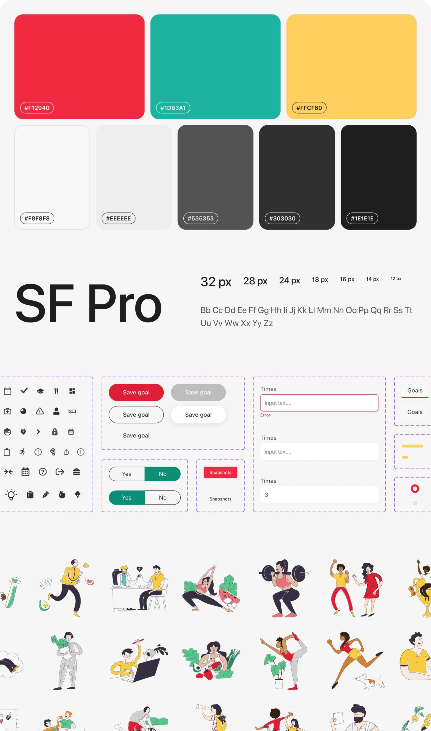
    A modular design system ensured consistency across onboarding, programs, progress tracking, and coaching experiences.

    Critical insights

    Designing digital health products for behaviour change requires patience and restraint. Clear structure, empathetic tone, and actionable feedback help users stay engaged without feeling overwhelmed.

    *This case study describes experience gained by team members across prior roles and engagements.
  • LG Ontolo

    LG Ontolo

    Project overview

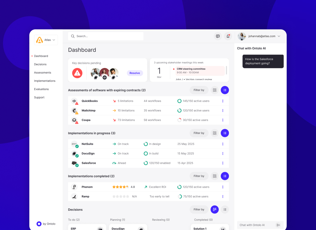
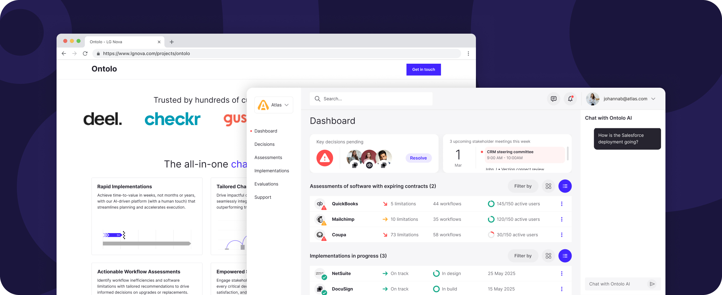
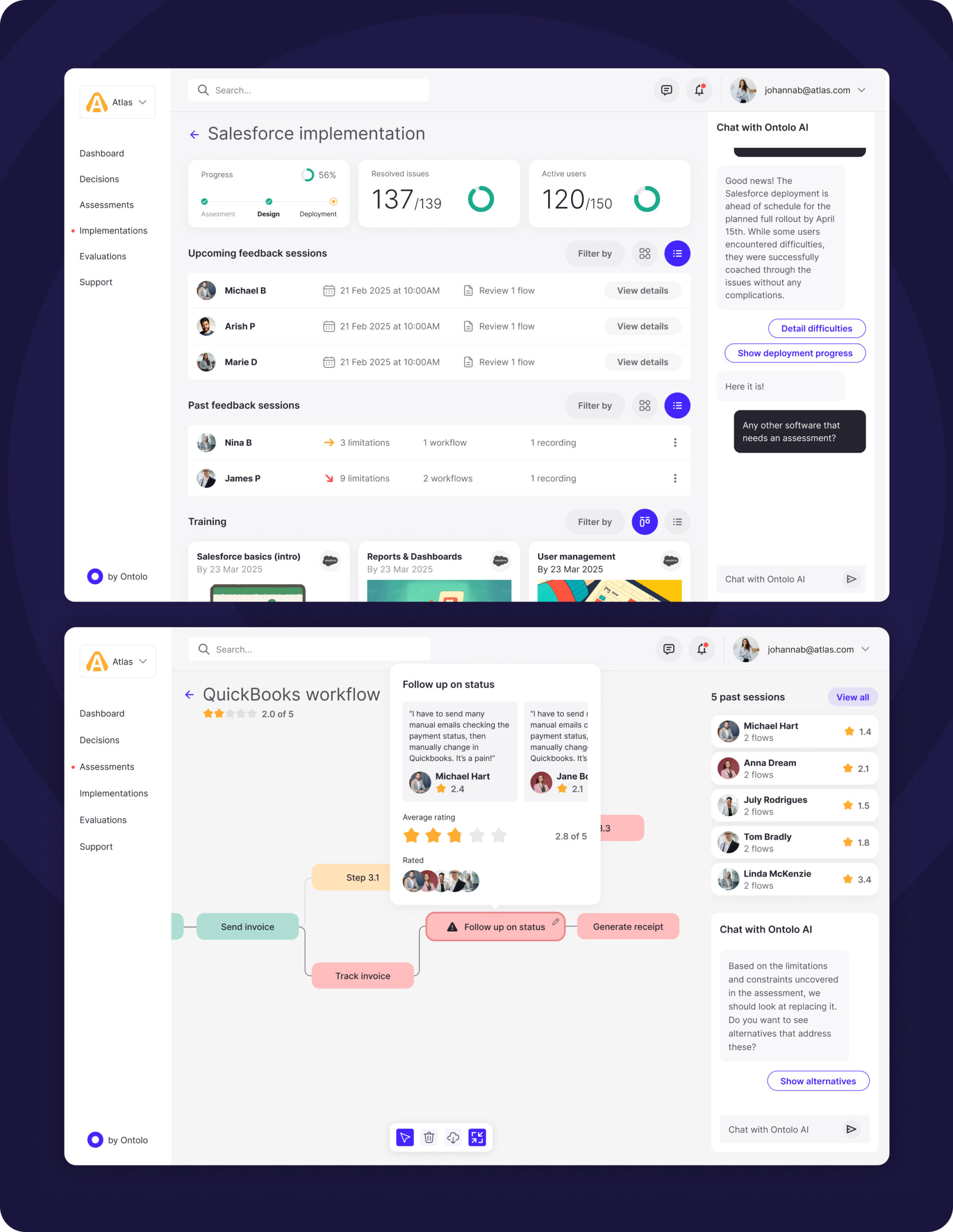
    Ontolo is an AI-powered enterprise web application developed as part of an LG innovation initiative. The platform helps organisations maximise the value of their software investments by simplifying how new tools are selected, implemented, adopted, and replaced across complex enterprise ecosystems.

    The project focused on web app UX & UI design for enterprise innovation, transforming highly manual, human-driven software decision processes into a structured, AI-supported experience. The goal was to reduce time-to-value, improve adoption, and support internal funding through a compelling proof of concept.

    Role
    UX & Product Design
    Team
    LG innovation, product, engineering
    Responsibility
    UX strategy, discovery facilitation, IA, interaction design, UI design, prototyping, illustration, design system foundations
    Timeline
    Discovery, proof of concept, internal validation


    Impact

    Faster time-to-value

    AI-supported analysis reduced delays in software selection and rollout.

    Clearer decisions

    Complex enterprise software choices were broken into step-by-step, outcome-driven flows.

    Reduced manual effort

    Previously human-heavy processes were streamlined through structured AI guidance.

    Improved adoption focus

    User feedback and desired outcomes were embedded directly into decision-making.

    Enterprise-ready UX

    Designed for executives, architects, and operational teams.

    Investor-ready POC

    An interactive prototype supported internal funding and innovation reviews.

    Scalable foundation

    The experience was built to support future expansion and deeper AI capability.

    Clear value narrative

    The platform clearly communicated how enterprises could maximise software ROI.


    Mission

    The mission was to design an AI-driven web app that helps enterprises make smarter software decisions faster. By combining user feedback, desired outcomes, and automated analysis, the experience aimed to remove friction from software assessment, planning, and rollout.

    Key challenges

    Enterprise complexity
    Managing interconnected systems, tools, and stakeholders.
    Manual decision-making
    Replacing slow, human-driven processes with AI support.
    Abstract AI value
    Making AI outputs understandable and trustworthy.
    Multiple audiences
    Designing for technical and non-technical decision-makers.
    Early-stage uncertainty
    Designing while the product vision was still forming.

    Objectives

    • Demonstrate clear enterprise value through a POC
    • Reduce time-to-value for software onboarding
    • Support internal funding and innovation approval
    • Create intuitive enterprise-grade workflows
    • Lay foundations for a scalable AI platform

    Design process

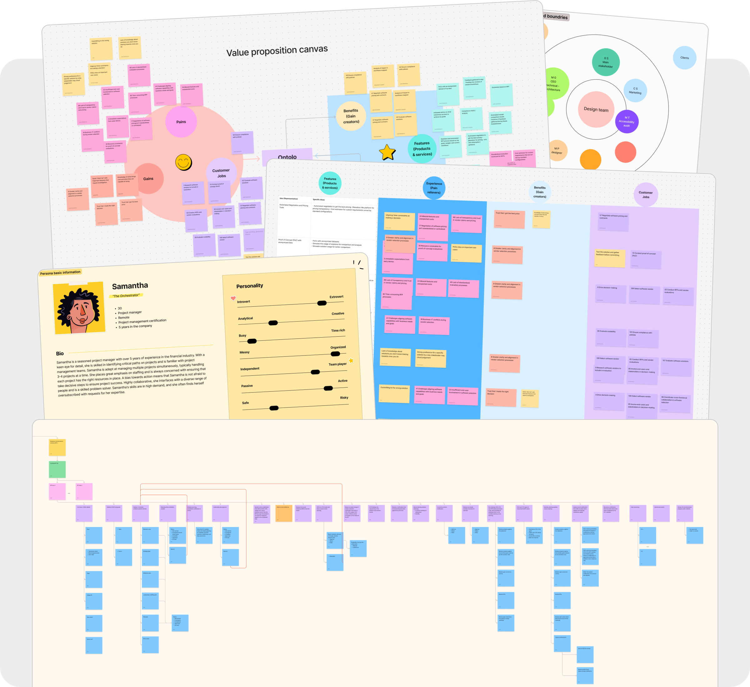
    The project began with a deep discovery phase typical of innovation and enterprise web app design. Workshops were facilitated to define ways of working, map stakeholders, clarify customer segments, and align on the business proposition before moving into solution design.

    Research & insights

    Discovery activities included kick-off sessions, stakeholder mapping, persona creation, user flow definition, and interviews. These insights shaped both the AI model assumptions and the UX direction.

    Ideation & wireframes

    Low-fidelity wireframes were produced for the POC web app and the marketing website, enabling rapid iteration and early alignment.

    Hi-fi designs & prototyping

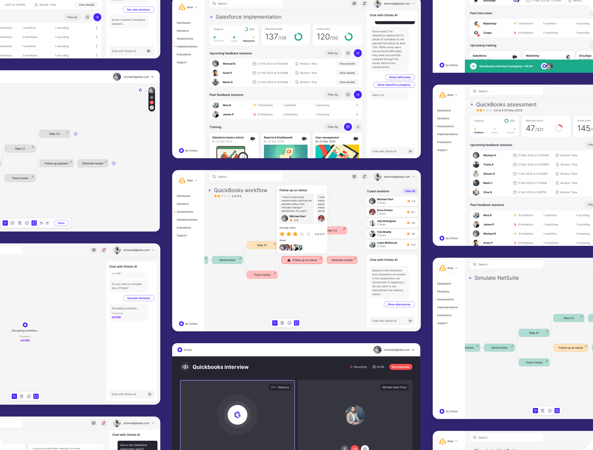
    High-fidelity designs were created for both the application and marketing site, supported by custom illustrations and an interactive prototype used for internal demos and validation.

    Testing

    Interactive prototypes were tested with stakeholders to refine clarity, flows, and perceived value before development investment.


    Accessibility

    Accessibility considerations focused on readability, contrast, and reducing cognitive load for enterprise decision-makers.

    Design system

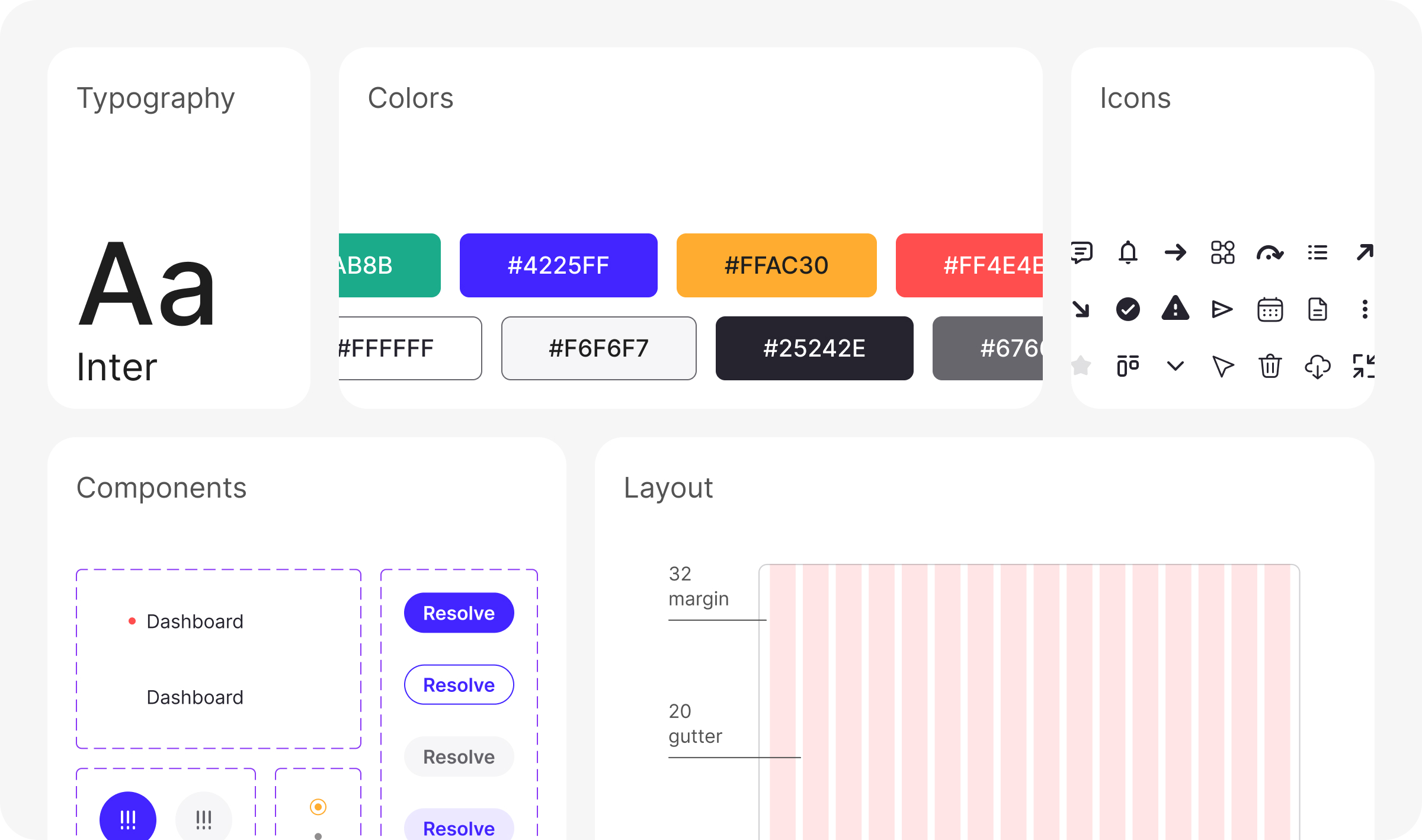
    A modular design system ensured consistency across dashboards, analysis steps, and decision workflows.

    Critical insights

    For AI-powered enterprise software to succeed, insight alone isn’t enough. The experience must guide users step by step, turning analysis into confident action and measurable business value.

    *This case study describes experience gained by team members across prior roles and engagements.
  • NHS Covid-19 app

    NHS Covid-19 app

    Project overview

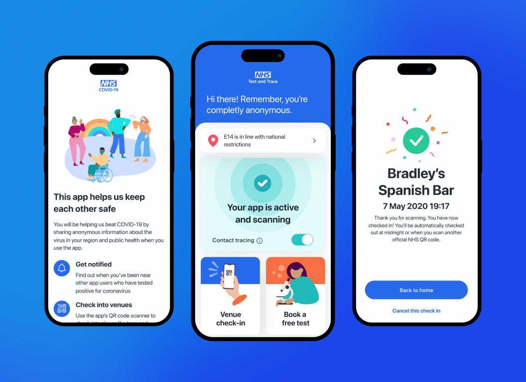
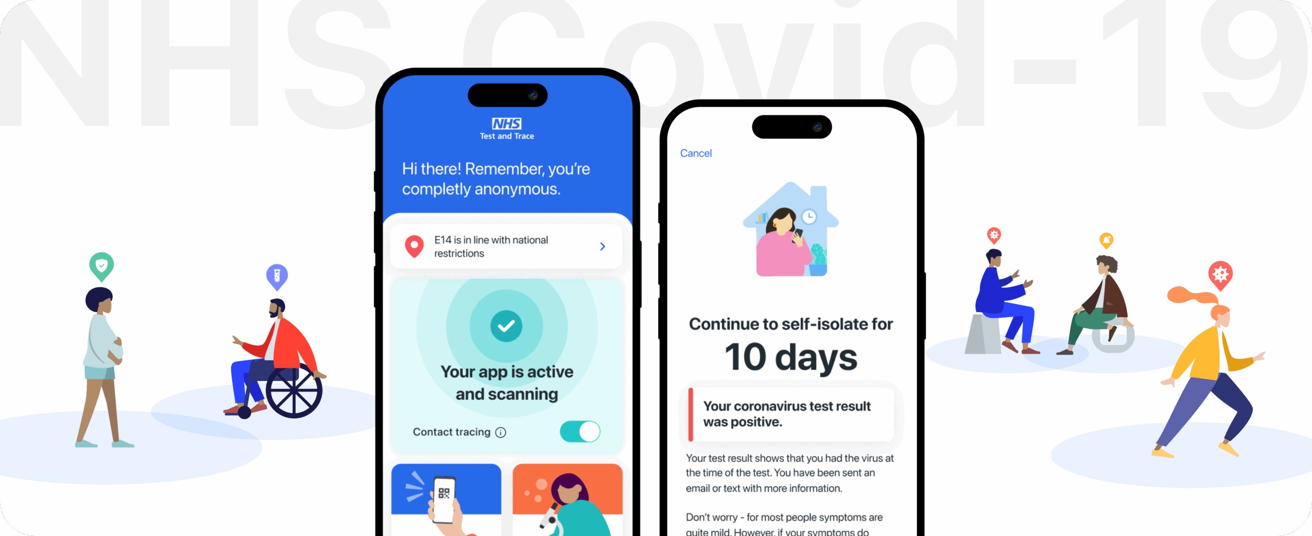
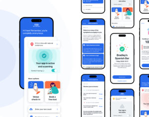
    This case study captures experience developed while contributing to a large-scale medical app created to support public health across England and Wales. The application enabled digital exposure notifications and health guidance, helping people respond to evolving medical risks during the COVID-19 pandemic.

    The work focused on UX & UI design for medical and healthcare applications, where clarity, accessibility, trust, and privacy were critical. Designing a medical app at national scale required careful balance between speed of delivery, regulatory constraints, and human-centred design.

    Role UX Leadership Contribution
    Team UK, Hong Kong, Switzerland, Germany, Scotland
    Responsibility Medical app UX/UI, research direction, information architecture, flows, interactions, workshops, prototyping, testing
    Timeline 6-weeks MVP, to reduce the second infection spike


    Impact

    600K lives saved

    The medical app supported national efforts to reduce infection spread through anonymous exposure alerts.

    4.8 App Store rating

    Clear communication and usability helped build trust during a public health emergency.

    30M+ active users

    The experience enabled large-scale adoption by addressing privacy and accessibility expectations common to medical apps.

    Delivered in 6 weeks

    A fully functioning healthcare application was designed and launched under extreme time pressure.

    Privacy-first design

    Health data was handled using privacy-preserving technologies to maintain public confidence.

    Distributed collaboration

    Medical app design was coordinated across multiple countries and time zones.

    Rapid iteration

    Design decisions were tested and refined quickly alongside engineering and research teams.

    Public health support

    Clear alerts and guidance helped users respond appropriately to medical risks.


    Mission

    The goal was to help shape a medical app that people could rely on during uncertain and stressful moments. The experience needed to clearly explain health risks, protect personal data, and guide users through sensitive decisions with empathy and precision.

    Key challenges

    Privacy concerns
    Users were wary of tracking and misuse of medical information.
    Trust perception
    Clear distinction between healthcare services and government systems was essential.
    Scale
    The app needed to work for the majority of UK smartphone users.
    Frontline contexts
    Healthcare and essential workers faced unique real-world constraints.
    Accessibility
    The medical app had to serve users with a wide range of abilities.
    Economic impact
    Isolation guidance affected income for many self-employed users.
    Without widespread adoption, the medical app could not deliver meaningful public health impact.

    Objectives

    • Build confidence in a medical app handling sensitive health data.
    • Create onboarding capable of supporting tens of millions of users.
    • Communicate health guidance in a calm, reassuring way.
    • Reduce friction in actions such as venue check-ins.
    • Explain isolation requirements without increasing anxiety.
    • Meet high accessibility standards expected of healthcare software.
    • Ensure the app could be used without training or external support.

    Design process

    The design approach blended Design Thinking and Lean UX, adapted for healthcare delivery. Methods were selected to support rapid decisions while respecting clinical, legal, and accessibility requirements expected of a medical app.

    Research & insights

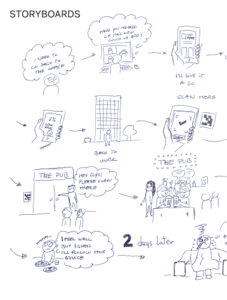
    Cross-functional sessions brought together UX, engineering, product, legal, compliance, behavioral science, and accessibility specialists. Shared scenarios and storyboards helped align teams around critical medical app journeys.

    Ideation & wireframes

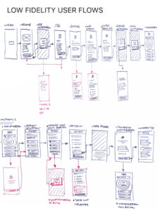
    User flows and wireframes were produced for all core features, allowing early validation of complex healthcare interactions.


    Hi-fi designs & prototyping

    High-fidelity UI designs were refined through continuous remote testing, with emphasis on privacy understanding and clarity of medical messaging.

    Testing

    Rapid usability testing supported frequent refinements as real-world usage patterns emerged.

    Accessibility

    Accessibility was embedded throughout the process to ensure the medical app worked for users with diverse physical, cognitive, and situational needs.

    Design system

    A cohesive design system helped maintain consistency and speed as the application evolved under intense delivery pressure.


    Critical insights

    Building a medical app at national scale required more than strong UX. Clear communication, public education, and alignment with healthcare messaging were essential. UX and UI design helped translate complex medical systems into experiences people could understand and trust.

    *This case study describes experience gained by team members across prior roles and engagements.
  • HSBC App

    HSBC App

    Project overview

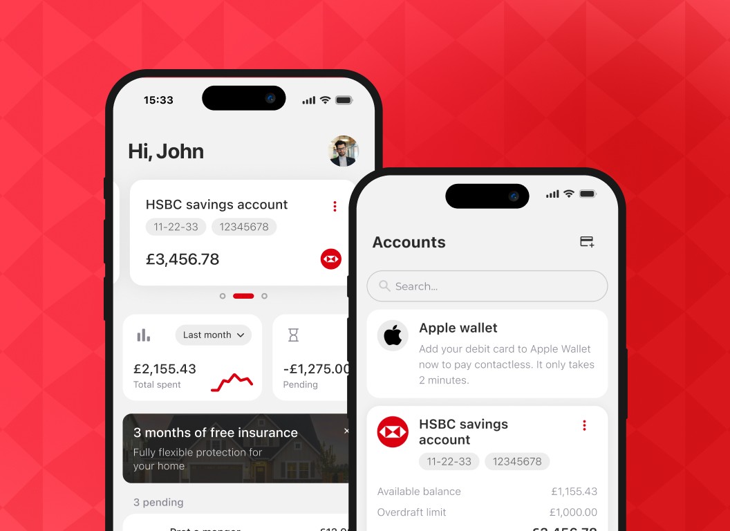
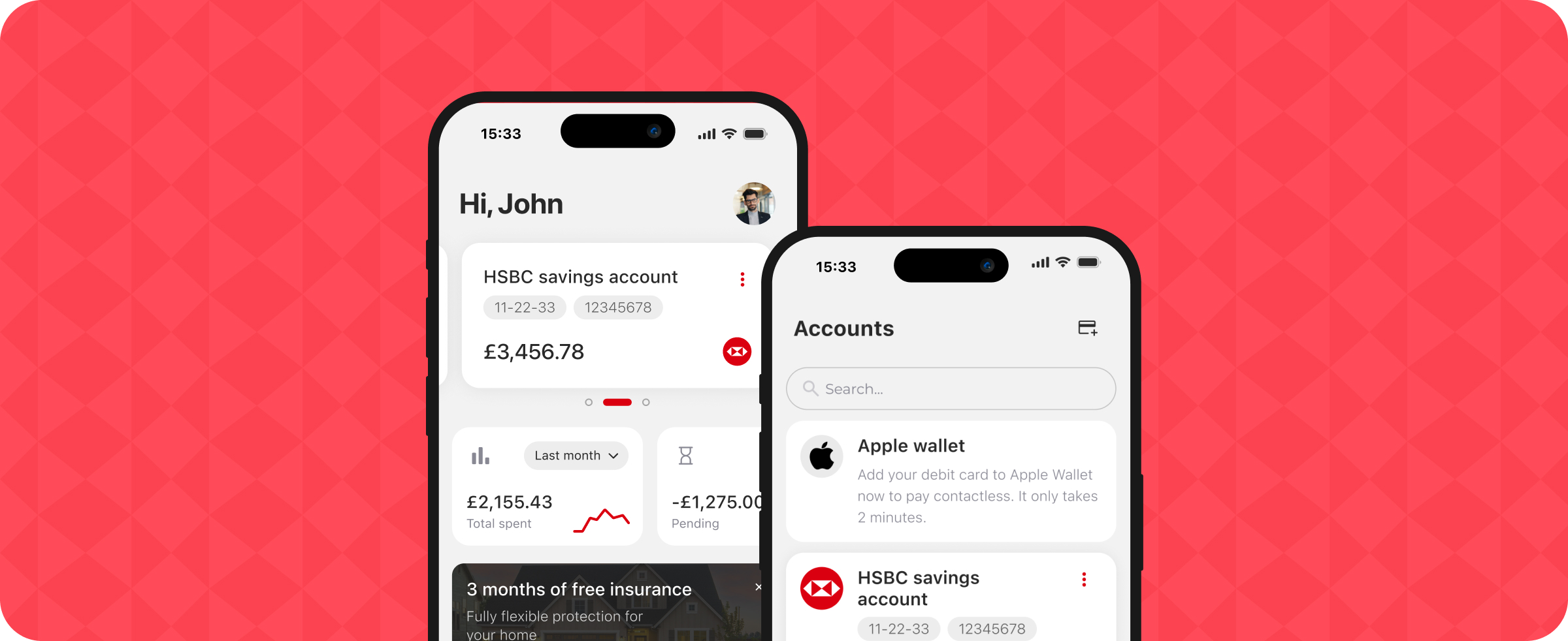
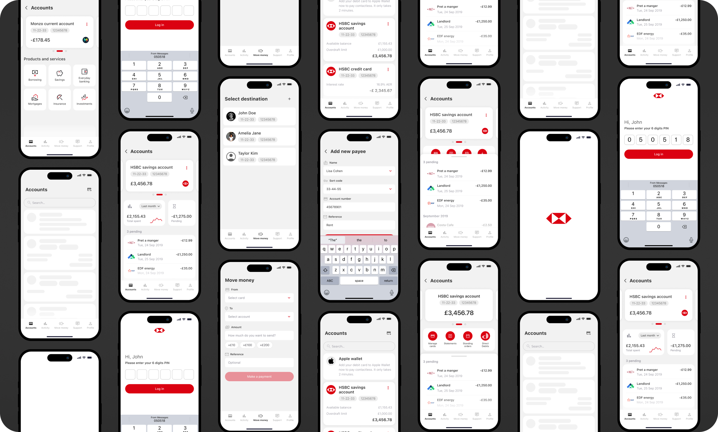
    This case study reflects experience gained through involvement in the design and evolution of a large-scale mobile banking app within a global financial institution in the UK. The work focused on mobile banking design and UX/UI improvements for a consumer-facing mobile banking application used by millions of users.

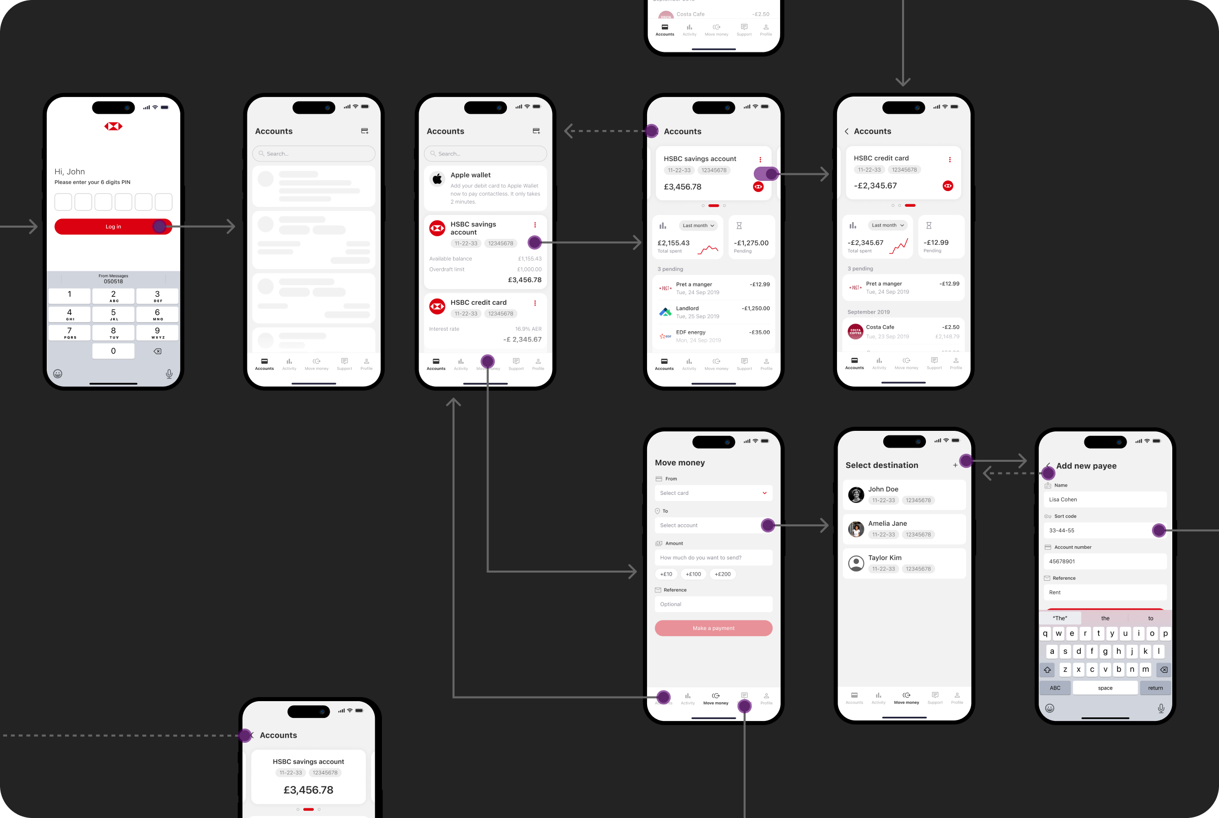
    Design Thinking and Lean UX methodologies were applied within a highly Agile environment to improve clarity, usability, and performance across critical mobile banking app journeys, including login, payments, transfers, and account management.

    Role UX Leadership Contribution
    Team UK, Mexico, India, France, Canada
    Responsibility Mobile banking UX/UI, user research, personas, workshop facilitation, IA, flows, interactions, low fidelity wireframes, high fidelity designs, prototyping, user testing, accessibility, Design system
    Timeline Pandemic-driven mobile banking acceleration, fully remote


    Impact

    4.8 App Store rating

    Mobile banking app usability improvements formed part of a broader initiative that coincided with an increase in App Store ratings from 1.9 to 4.8 stars.

    6M+ users

    The improved mobile banking experience supported continued growth from approximately 1.5M to over 6M active mobile app users.

    12× faster

    Core mobile banking app flows were streamlined, contributing to significant performance improvements.
    6× release frequency

    Clearer UX/UI structure enabled more frequent mobile banking app releases.

    Faster task completion

    Users completed essential mobile banking tasks such as payments and transfers more efficiently.

    Higher engagement

    Simplified dashboards encouraged more frequent interaction with the mobile banking app.

    Reduced support tickets

    Clearer mobile banking UX helped reduce customer confusion.

    Financial confidence

    Improved visual hierarchy supported better understanding of finances within the mobile banking app.


    Mission

    The mission was to shape a trustworthy and intuitive mobile banking app during a period of increased reliance on digital banking. By simplifying information architecture and refining interactions, the experience reduced friction and helped users manage money confidently through a well-designed mobile banking interface.

    Key challenges

    Multiple user types
    Designing mobile banking UX for diverse global audiences.
    Legacy UX problems
    Resolving outdated and inconsistent mobile app flows.
    Complex login
    Reducing friction in secure mobile banking authentication.
    Stakeholder alignment
    Aligning global teams around mobile banking priorities.
    Localization consistency
    Ensuring consistent mobile banking experiences across markets.

    Objectives

    • Create a modern, intuitive mobile banking app
    • Align teams around clear mobile banking journeys
    • Reduce friction in login, balance checks, and payments
    • Support scalability across mobile platforms
    • Improve satisfaction and reduce complaints

    Design process

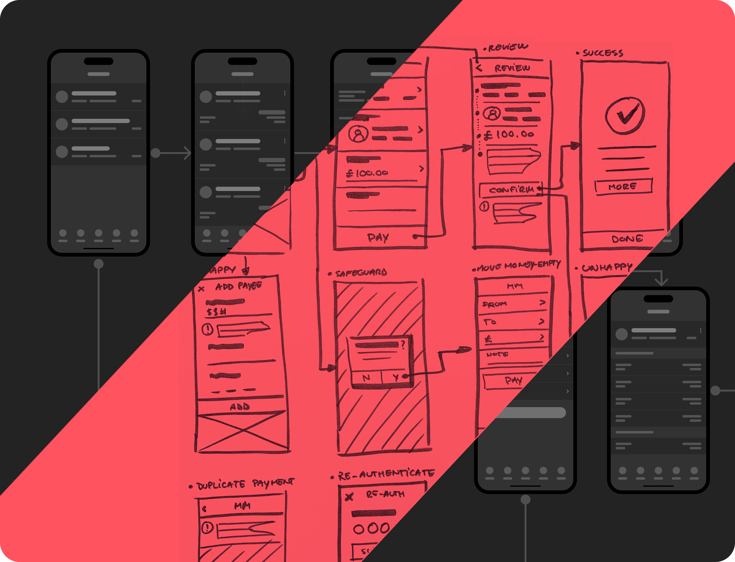
    The mobile banking UX/UI design process combined usability testing, heuristic analysis, and iterative prototyping. Core mobile banking app journeys were mapped, friction points identified, and flows refined to improve clarity, speed, and reliability.

    Research & insights

    Stakeholder interviews, system audits, competitor analysis, and user research uncovered key mobile banking usability issues.

    Ideation & wireframes

    Low-fidelity mobile banking flows were created and aligned through collaborative cross-functional workshops.

    Hi-fi designs & prototyping

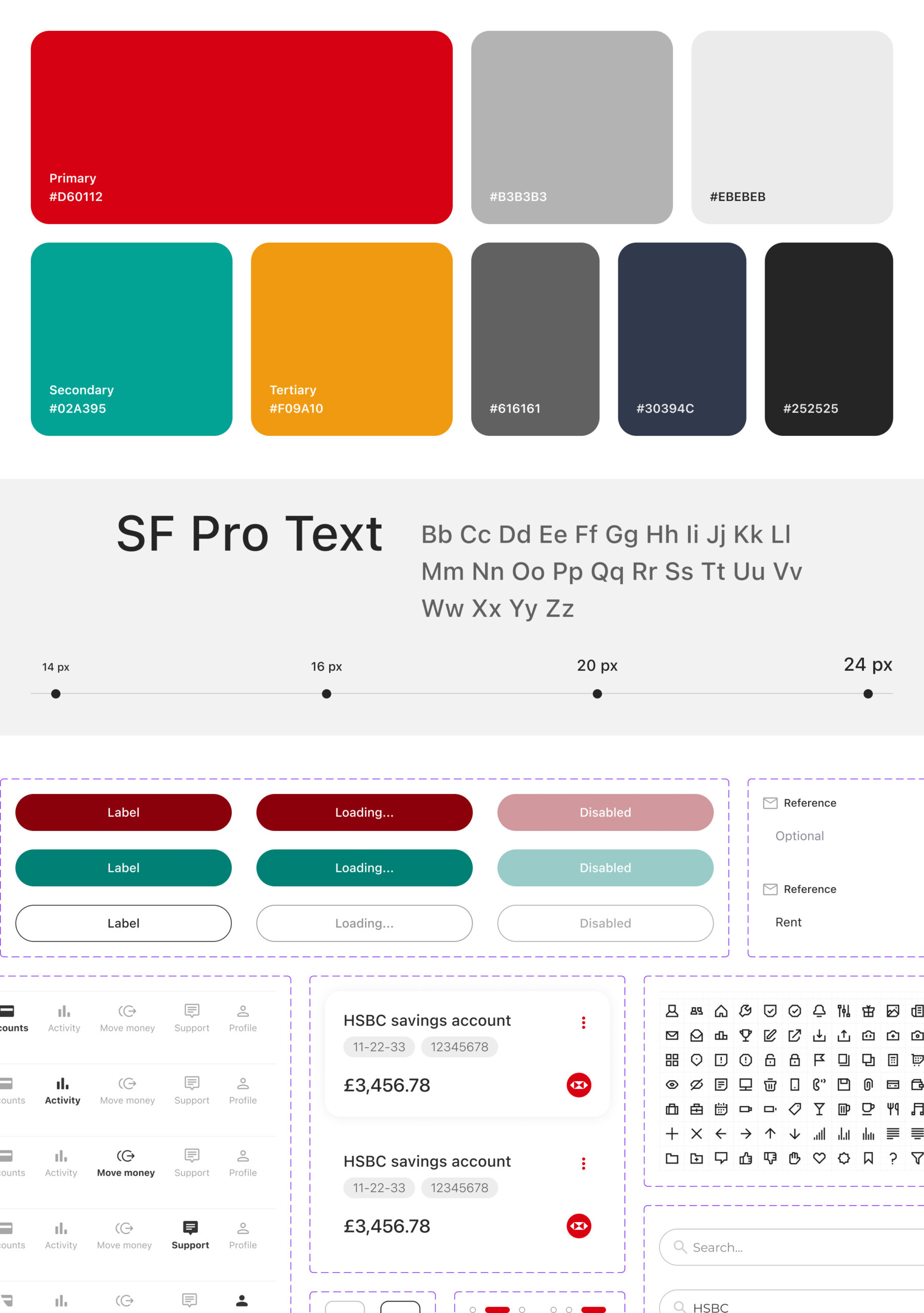
    High-fidelity mobile banking UI designs were produced and validated through rapid prototyping.

    Testing

    Early mobile app releases reached tens of thousands of users, enabling data-informed improvements.

    Accessibility

    Remote usability testing of the mobile banking app identified mostly minor accessibility issues, which were addressed quickly.

    Design system

    Structured mobile banking user flows and wireframes were translated into interactive prototypes to support rapid validation.

    Critical insights

    Designing a mobile banking app at scale requires balancing security, regulation, and usability. Continuous user validation and fast feedback loops proved essential during periods of rapid digital adoption.

    *This case study describes experience gained by team members across prior roles and engagements.